Death Cross Golden Cross in Crypto Charts: Meaning and Signals

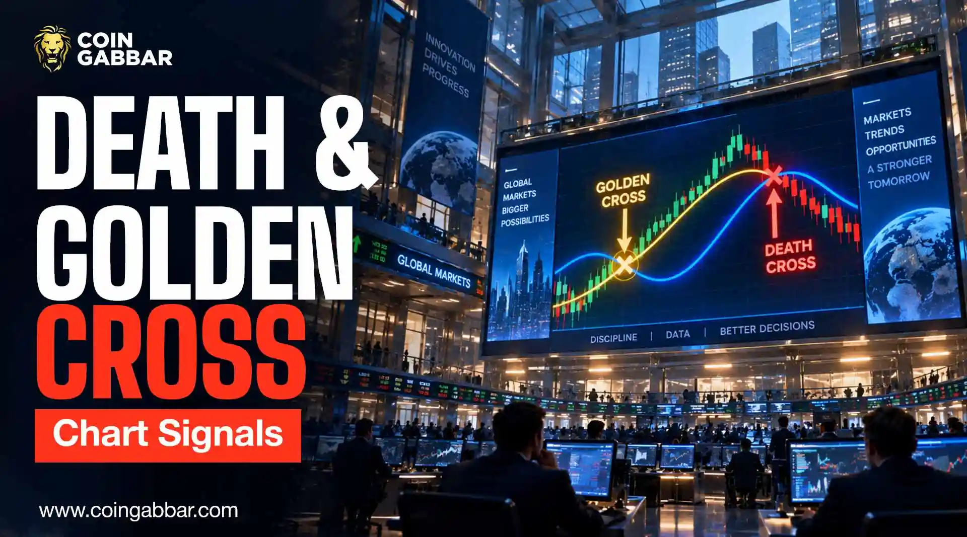
Why This Old Stock Market Signal Still Shows Up on Crypto Charts
Chart watchers have been staring at this same pattern for decades, long before crypto even existed. A Death Cross Golden Cross setup is really just two moving averages crossing paths, one warning of trouble ahead, the other hinting that momentum is turning in a trader's favor.
It sounds simple, and it is, but knowing what to do with that information matters more than spotting the cross itself. Used the right way, a reading becomes one piece of a wider crypto portfolio strategy, not a signal to act on by itself.
This piece walks through what it actually means, how the averages behind them work, and where traders usually get it wrong when they trust the pattern on its own.
How Do Moving Averages Work in Crypto Trading Charts?
A moving average just smooths out the daily ups and downs by averaging closing prices over a set number of days, so you get a cleaner line instead of a jumpy one.
The 50-day line follows what's been happening lately, while the 200-day line shows the bigger picture over a much longer stretch. Most charting tools, including TradingView, draw both lines for you the moment you pick them from the indicator list; no manual work needed.
Watching how these two lines move against each other is really what creates. Once the faster line catches up to the slower one and actually crosses it, that crossing point tells you whether the market's leaning bullish or bearish.
What Is a Death Cross in Crypto, and What Does It Signal?
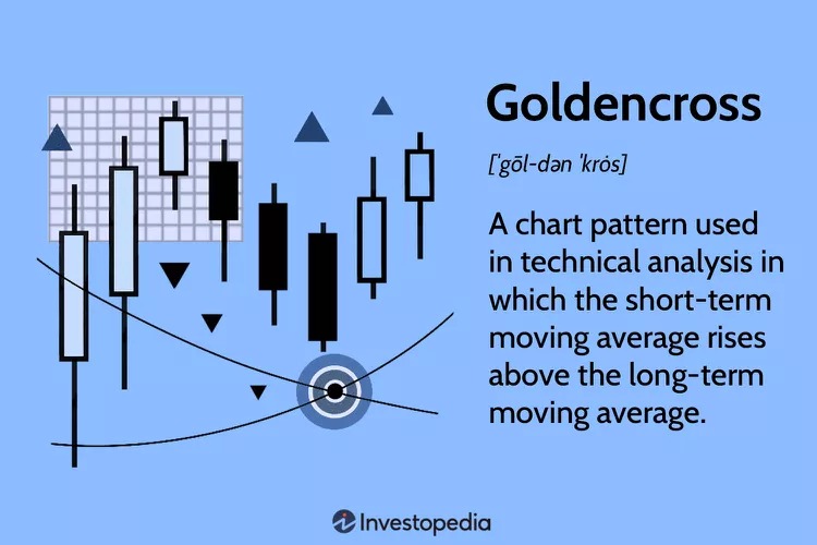
A death cross happens when the 50-day moving average slips below the 200-day moving average. Traders usually call it a lagging indicator, which just means it shows up late. It only confirms weakness after the price has already started dropping, not before.
Pull up a Bitcoin chart on Binance, and you'll likely spot this exact pattern from past market corrections, where the crossover only showed up well after the sell-off had already gotten going. Most of the time it appears once a decline is already underway, so it's more of a "yep, this is still bad" signal than an early warning.
Most of the time, it shows up once the price has already been falling for a while, so it works more as confirmation that the decline is still ongoing rather than as an early warning.
What Is a Golden Cross in Crypto, and What Does It Indicate?
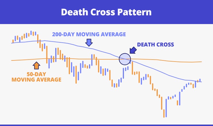
The bullish half of the pair. It shows up when the 50-day average climbs back above the 200-day average, which basically means recent buying has gotten strong enough to push past the longer-term trend.
Check the price data on CoinMarketCap, and you can usually tell whether a move like this is backed by real volume or just a quick spike that won't last. Traders often read it as an early hint that a bigger uptrend could be forming, but it's still worth glancing at support and resistance levels before assuming the move actually sticks.
Traders often see it as an early sign that a bigger uptrend might be starting, but it's still worth checking support and resistance levels before assuming the move will hold. Here's what it typically looks like on a real chart:
How Do the 50-Day and 200-Day Moving Averages Work?
These two timeframes stuck around as the standard because they hit a nice balance, quick enough to react but steady enough not to overreact. The 50-day line moves with recent price swings, while the 200-day line barely budges from short-term noise; it's built to smooth things out.
When these two lines finally meet, that meeting point is what actually decides whether you're looking. You'll find shorter pairings out there too, but 50/200 is still the one traders reach for most, whether they're checking a Bitcoin price chart or scanning an Ethereum setup.
What Is the Difference Between a Death Cross and a Golden Cross?
Feature | Death Cross | Golden Cross |
Direction | 50-day crosses below 200-day | 50-day crosses above 200-day |
Signal type | Bearish | Bullish |
Common timing | After a price decline | After a price recovery |
Trader interpretation | Weakening momentum | Strengthening momentum |
How Do Traders Confirm These Crypto Chart Signals?
A crossover alone rarely gets treated as a final answer. Traders often check trading volume around the crossover point, since one backed by strong volume carries more weight than one that forms during quiet, low-liquidity trading.
That connection to overall market liquidity conditions is part of why volume confirmation matters so much here.
Thin volume can produce a crossover that looks convincing on paper but fades within days.
Can Death Cross and Golden Cross Signals Give False Alerts?
Yes. Both patterns are lagging indicators, meaning they confirm a shift only after the price has already moved.
A death cross can appear right before a bounce, and a golden cross can show up just before a reversal, especially in sideways or choppy markets.
That lag is the main reason any pattern gets treated as a clue rather than a guarantee.
How Should Traders Use These Patterns With Other Indicators?
A crossover on its own only tells part of the story. Pairing it with something like RSI, or just glancing at where support and resistance sit, usually helps separate the signals worth paying attention to from the ones that fade out fast.
Position sizing matters too, honestly, probably more than people give it credit for. Leaning on one indicator to make a call is risky, so it helps to zoom out and look at the broader market before acting on a single reading.
And it's worth remembering that rules around crypto trading can shift without warning, and when that happens, it can throw off a technical setup that looked solid just days earlier.
What Are the Main Risks of Trading Crossovers Alone?
A few risks stand out when this signal gets used in isolation:
Late signals, since the crossover only confirms after the price has already moved
False positives in sideways or low-volume markets
Overreliance on one indicator instead of a broader market view
Security gaps that have nothing to do with the chart itself, the kind covered in recent crypto security incidents
Skipping basic wallet safety practices while chasing a signal-based entry or exit
What Does the Data Say About These Crossover Signals?
The stronger signal is volume-backed confirmation; a crossover on thin trading volume tends to fade faster than one supported by a genuine surge in activity.
The main concern is timing, since both halves of a setup confirm a move that has already partly happened rather than predicting what comes next.
Traders should verify the crossover against recent volume and at least one other indicator, using a resource like the Bitcoin price chart, before treating it as meaningful.
Conclusion
The Death Cross Golden Cross pair remains one of the simplest tools in technical analysis, built entirely on how two moving averages interact over time.
A flags weakening momentum, while a strengthening momentum but neither one guarantees what happens next. Pairing either signal with volume, other indicators, and sound risk management keeps expectations realistic rather than overconfident.
Disclaimer
This article is meant to share general information, not financial advice. Chart patterns like these are useful for spotting trends, but they don't come with any guarantees, and what happened in the past doesn't mean it'll happen again.