Why Crypto UX Is Complicated and What Must Change for Mass Adoption

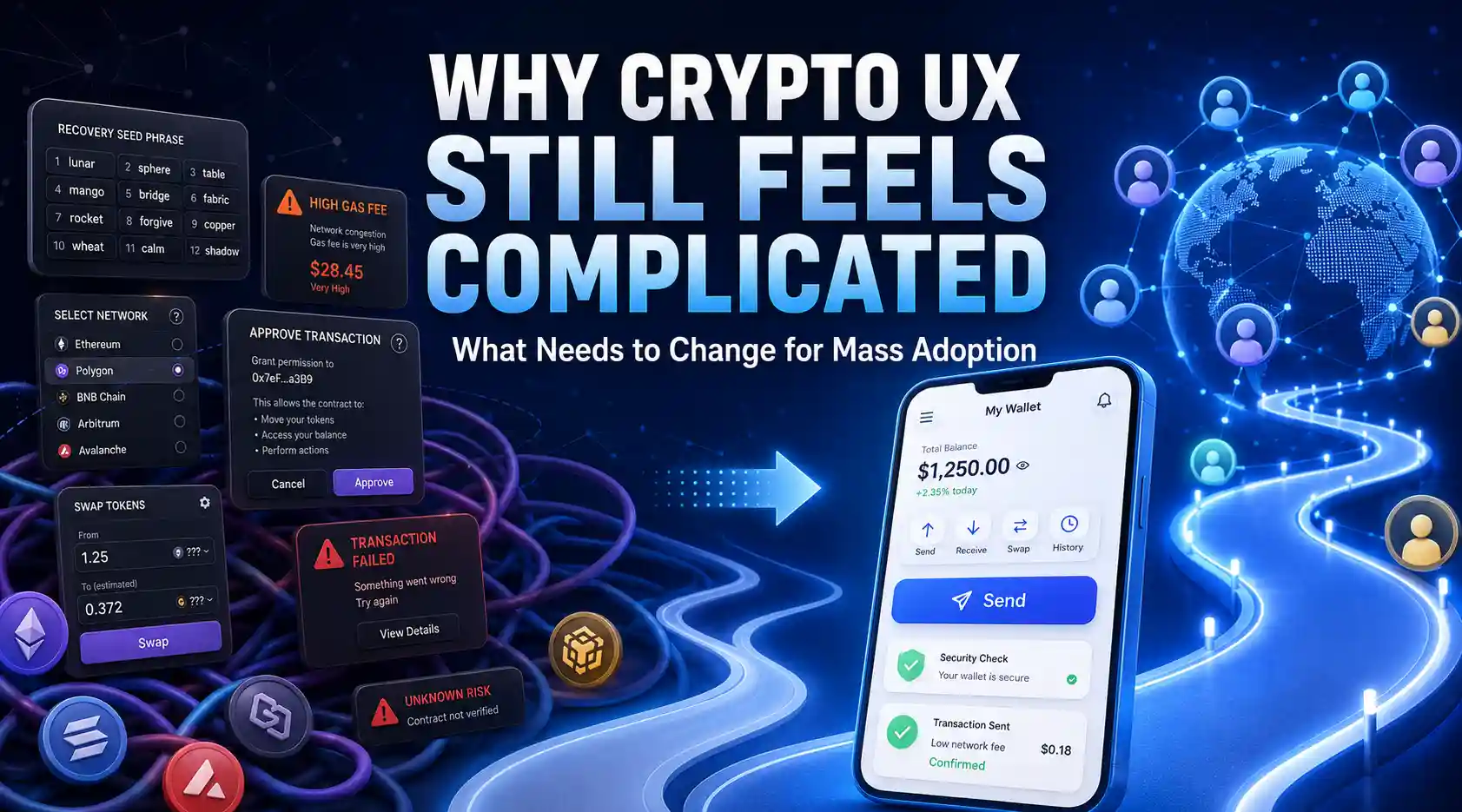
Crypto promised ownership, open finance, and instant settlement. Yet a normal wallet setup still asks people to copy twelve secret words, approve blind signatures, pick networks, and pay fees named after gas. That is a lot before anyone buys a coffee or sends twenty dollars.
The awkward part is not limited to crypto apps. People compare every financial interface with the simplest sign-up they know. A card form shows boxes in order. A delivery app remembers addresses. After payment, the screen says what happened in one line. Support links are visible too. Even gaming or entertainment sites such as starbuck88 casino, where the first task is obvious, make the path feel direct: create an account, deposit, play.
No seed phrase appears. No network selector sits in the corner. A similar contrast shows up with loyalty-style portals like l89 vip, because users expect clear status, simple balances, and quick recovery. Crypto still asks them to understand infrastructure before they understand the product.
The first five minutes break trust
Most newcomers do not quit after losing money. They quit before the first transaction confirms.
A wallet asks for a seed phrase, then warns that no one can help if it is lost. That warning is true, but it feels hostile. Banks reset passwords. Apple restores phones from iCloud. Crypto says, in effect, one spelling mistake can burn the account forever.
Then the app asks for a chain. Ethereum, Base, Arbitrum, Polygon. The names look like product choices, but they are settlement systems with different bridges, fees, and failure modes. A beginner sees four doors and no map.
Good UX would hide most of that during setup. The user wants a balance, a contact, and a send button. Advanced controls can live one layer deeper, with plain labels and a sandbox transaction for the first payment.
Fees should feel like postage, not weather
Gas fees scare people because the number changes while they stare at it. One minute a swap costs $1.10. A few minutes later it costs $8.43, and the app acts as if this is normal.
No checkout page should feel like a storm forecast.
Mass use needs fee abstraction. The product can quote one price, pay network costs in the background, and settle later. Some wallets already sponsor small transactions on Base or Polygon, especially for games and social apps. That pattern should become boring. If sending five dollars costs five dollars and twelve cents, the screen should say so before the user taps confirm.
The same rule applies to failed transactions. Charging someone for an error feels like a parking ticket for a broken meter. Apps should simulate actions first, show the likely result, and block known failures before money leaves the account.
Recovery must stop feeling like a trap
Self-custody sounds clean in a conference talk. At a kitchen table, it means a person must protect twelve words from fire, theft, screenshots, phishing, and forgetfulness for years.
That is too much.
Better recovery already exists in pieces. Social recovery lets trusted contacts approve a reset. Passkeys bind access to a device with biometrics. Multi-party computation splits keys so no single company holds the full secret. None of these ideas is perfect, but each feels closer to how ordinary accounts work.
The missing piece is clear language. “Guardian” sounds safer than “key shard.” “Recover with two contacts” beats “threshold signature policy.” The app should explain the trade-off in one screen, using examples: lose a phone, replace a laptop, die and leave funds to family. Crypto will feel less strange when recovery sounds like life.
Jargon should move behind the curtain
A user does not need “RPC endpoint,” “nonce,” or “slippage tolerance” on the first screen. Those terms belong in advanced settings, logs, and developer docs.
Short labels win.
A payment app can say “slow,” “standard,” or “fast,” then show the fee difference in cents. A wallet can say “This token lives on Arbitrum” and offer a safe transfer path instead of forcing a bridge hunt. A DeFi app can explain a swap with one receipt-style preview: pay USDC, receive ETH, fee, estimated time, worst-case price.
The best crypto products will borrow from boring software. TurboTax asks one question per screen. Wise shows exchange rates before sending. Google Maps hides routing math. Crypto should do the same with chains and signatures.
Adoption starts with boring defaults
Mass adoption will not arrive through another acronym. It will arrive when a person can receive ten dollars, recover an account, and understand the fee without asking Discord.
Builders can start small. Remove one network choice. Rename one warning. Add one practice payment with test funds. Then watch five people use it in silence, because the confused pause always tells the truth.