Near Protocol Price Prediction: The Levels That Matter Most


NEAR Protocol price prediction chatter is heating up again, with the token sitting near $1.92 in a tight, undecided range.
NEAR launched in 2020, built by Illia Polosukhin and Alexander Skidanov as a scalable, developer-friendly Layer-1, and later repositioned itself around AI-native applications, chain abstraction, and user-owned agents rather than payments or meme narratives.
That history matters here; this is infrastructure still finding its valuation years after a 2022 peak, not a token riding a short-term trend.
The data below breaks down exactly where price stands right now and what's actually moving it, including one detail most quick takes on NEAR are skipping: leveraged longs have been taking the losses while the market waits on a move that hasn't been confirmed yet.
The Numbers Right Now
| Metric | Value | Source |
|---|---|---|
| Price | $1.92 (-0.68% 24h) | Exchange Aggregator |
| Market Cap | $2.5B (-0.57% 24h) | CoinMarketCap |
| Unlocked Market Cap | $2.44B | CoinMarketCap |
| 24h Volume | $152.8M (+49.29% 24h) | Exchange Aggregator |
| Volume/Market Cap | 6.1% | Calculated |
| Fully Diluted Valuation | $2.5B | CoinMarketCap |
| Circulating Supply | 1.3B NEAR | CoinMarketCap |
| Holders | 12,630 | On-chain Tracker |
| All-Time High | $20.44 (Down 90.6%) | CoinGecko |
Source: Near Protocol Marketcap
Two numbers here are doing more work than the rest. NEAR is still down over 90% from its 2022 high, so any $2.40 target should be read as a range breakout, not a comeback story.
And volume jumped nearly 50%, while price barely moved 0.68%.
That mismatch is basically the definition of a market that's active but undecided.
Near Protocol Price Prediction: Who's Actually Trading This 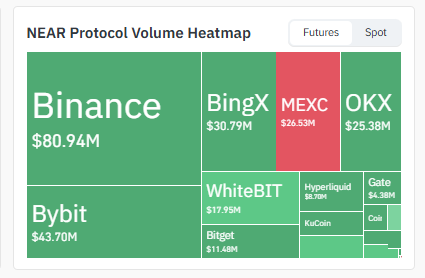
| Exchange | 24h Futures Volume | Share |
|---|---|---|
| Binance | $80.94M | ~33% |
| Bybit | $43.70M | ~18% |
| BingX | $30.79M | ~13% |
| MEXC | $26.53M | ~11% |
| OKX | $25.38M | ~10% |
| WhiteBIT | $17.95M | ~7% |
| Bitget | $11.48M | ~5% |
| Hyperliquid | $8.70M | ~4% |
| Gate | $4.38M | ~2% |
Source: derivatives volume heatmap from Coinglass
A third of all futures flow sits on one exchange.
That's not unusual for a mid-cap token, but it does mean Binance's order book has an outsized say in where NEAR's short-term support and resistance actually sit more than any technical indicator does.
MEXC's book, by comparison, is flagged as having thinner liquidity in the source data, so treat wicks on that venue with some skepticism.
The Liquidation Data Tells a Different Story Than the Price Chart
Look at the 24-hour column: longs make up 73% of everything liquidated.
Price hasn't crashed; it's basically flat over the same period. So why are long traders bleeding? Because they keep opening positions ahead of a breakout, and every time price fails to clear resistance, they get flushed out. 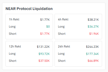
| Window | Total | Long | Short |
|---|---|---|---|
| 1h | $1.77K | $0 | $1.77K |
| 4h | $38.21K | $36.27K | $1.94K |
| 12h | $131.22K | $93.72K | $37.50K |
| 24h | $244.23K | $177.34K | $66.89K |
Source: Coinglass liquidation tracker,
This is the clearest signal in the whole dataset, and it's easy to miss if you're only looking at the candles: the market is positioned bullish, but the chart hasn't confirmed it yet.
4-Hour: An Ascending Trendline That Keeps Getting Respected
On the 4H NEAR/USDT chart, the price has been climbing along a rising trendline since the last local low, and it's not the first time this line has been tested; every dip toward it so far has been bought.
Which is what makes it worth watching now rather than just another line on the chart. The price is sitting right at that trendline again, around $1.93, and this touch works like a decision point: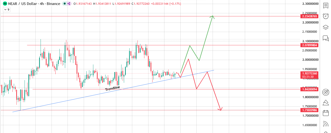
Source: Chart Taken From TradingView
-
If the trendline holds: meaning and the price bounces off it the way it has on previous touches, the move higher opens up toward $2.08 first, a brief pause there, then continuation to $2.23.
-
If the trendline breaks: a clean close below it, not just a wick, that support gets replaced by resistance, and price is more likely to drift back to $1.84. If $1.84 doesn't hold either, $1.73 is the next level down.
In short: this trendline has been the line separating "still in an uptrend" from "not anymore."
As long as the price keeps finding buyers on it, the higher targets stay in play. The moment it gives way cleanly, the setup flips and the lower levels become the more likely path.
Daily: A Triangle That's Almost Out of Room
Zoom out to the daily chart, and NEAR is forming a symmetrical triangle, a swing high near $2.60, and a swing low near $1.78, and the price has now worked its way right into the apex, the point where the upper and lower trendlines converge.
That's the part of the pattern that matters most: the closer the price gets to the apex, the less room it has to keep coiling, and the sooner it has to pick a direction.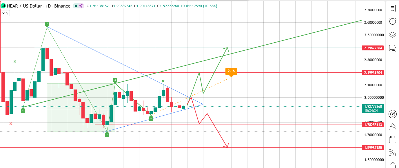
Source: Chart Taken From TradingView
Adding to that, the chart's Wolfe Wave indicator, built off the five labeled swing points on the daily candles, is pointing to the same $2.16 area as its projected target, which lines up closely with the triangle's own upper boundary.
Two separate pattern reads converging on roughly the same number is worth noting; it doesn't guarantee the move, but it does make $2.16 a level worth watching more closely than a random resistance line would be.
From here, there are only two ways this plays out:
-
Upside breakout: if the price closes above the upper boundary, around $2.16–$2.20, that's the market choosing the higher path, with $2.40 as the first target and $2.60 possible on follow-through.
-
Downside breakdown: if the price closes below the lower boundary, around $1.78, that's the market choosing the lower path, with $1.60 as the first target and $1.30 possible if selling keeps up.
A triangle sitting at its apex doesn't stay quiet for long. Once the price is this close to both lines, a decisive move up through resistance or down through support usually shows up within the next handful of sessions, not weeks from now.
Putting the Layers Side by Side
| Layer | Bullish Read | Bearish Read |
|---|---|---|
| 4H Trendline | Bounce $2.08 $2.23 | Break $1.84 $1.73 |
| Daily Triangle | Break $2.20 $2.40 $2.60 | Break $1.78 $1.60 $1.30 |
| Liquidation Positioning | Longs dominant, betting on upside | Repeated stop-outs, thesis unconfirmed |
| Trader Commentary | Reclaim the above trendline = real improvement. | Failed breakout = sellers still in control. |
Four separate data sources, same conclusion: nobody's won this yet. The traders who've already tried to front-run the answer are the ones showing up in the liquidation numbers.
Near Protocol: One More Chart, From X
A trader going by @CryptoTheBossX posted a different read on the NEAR/USDT longer trendline, wider view.
Their version shows a descending line that's capped every recovery since the last major swing high, with a horizontal demand zone still doing its job underneath. 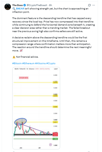
Source: Data Taken From X.
According to them, price has compressed into that trendline instead of trending, and a recent breakout attempt near the last swing high failed, which they read as sellers still being in charge.
The post frames a clean close above that descending trendline as the first real sign anything's changed; until then, in their words, it's a "confirmation over anticipation" situation. Standard disclaimer attached: not financial advice.
It's a different timeframe than the charts above, but it lands in the same place. Resistance keeps holding. Confirmation hasn't arrived.
Three Target Scenarios
| Scenario | Trigger | Target | What Kills It? |
|---|---|---|---|
| Bullish | Daily close above $2.20 | $2.40, then $2.60 | Rejected back under $2.08 within a candle or two |
| Bearish | Daily close below $1.78 | $1.60, then $1.30 | Price reclaims $1.84 on the 4H |
| Range-bound | Stuck between $1.78 and $2.20 | Nowhere, for now | This is where it's been sitting |
Worth remembering going in: NEAR isn't marketed as a payments coin or a meme play. It's positioned around AI agents and chain abstraction, so comparing its chart to something like a dog-themed token doesn't tell you much beyond "both are volatile."
Where This Sits in the Bigger Picture
Bitcoin dominance has been floating around 55–56% through mid-July 2026, per CoinGecko, after touching above 60% earlier this year.
When dominance falls, it usually means money is spreading out into altcoins instead of parking in Bitcoin, generally a tailwind for tokens like NEAR.
It's not a guarantee, though. Dominance swings back fast, and a move back toward 60% would likely make any altcoin breakout harder to sustain, NEAR included.
None of the levels above change because of this, but it's context a pure price-target headline usually leaves out.
What Could Go Wrong
Triangles break both ways, and this one is no exception; the shape itself doesn't lean bullish or bearish.
There's already been one failed breakout attempt, and both the liquidation data and the trendline commentary point to the same event.
Liquidity is concentrated on a handful of exchanges, so a thin order book somewhere can print a wick that has nothing to do with real supply and demand.
NEAR also issues new tokens annually to fund validator rewards and its protocol treasury, per CoinMarketCap's tokenomics data, a slow drag that matters more the longer someone plans to hold.
And beyond the chart entirely, mid-cap tokens carry regulatory and exchange-listing risk that no support level accounts for.
Last thing: everything in this article is a snapshot. Check price, volume, and liquidation numbers against a live source like CoinMarketCap, CoinGlass, or TradingView before acting on any of it.
Methodology
Market data (price, market cap, supply, and holders) comes from CoinMarketCap and CoinGecko.
Exchange volume and liquidation figures come from CoinGlass-style derivatives tracking. Chart levels are read directly off TradingView candlesticks on the NEAR/USDT pair, 4-hour and daily, Binance feed.
Holder counts can be cross-checked on NearBlocks, NEAR's native explorer. The X post cited above is one trader's opinion, not verified on-chain research; it's labeled that way throughout rather than presented as fact.
Disclaimer: This article is informational commentary based on publicly available market data. It is not financial, investment, or trading advice, and the author is not a licensed financial advisor. Cryptocurrency prices are volatile and can move sharply within hours. Verify all figures against a live source and consult a licensed professional before making financial decisions.
Also read: